


Kitchen Colour Considerations: What Should You Think About Before Starting a Remodel? Your kitchen is likely to be one of the most widely used rooms in your home, and also one of the most expensive to remodel. Even a minor lick of paint can cause huge domestic disruption, so it pays to spend a little time choosing your colour scheme and other decor details carefully before you begin, so that you have a result you’ll love for years to come. What are the colour considerations you need to bear in mind when planning your dream kitchen?
Building From the Basics
Depending on how drastic your remodel or redecoration can be, it will have to take these foundations into account, and build around them when putting together the rest of your choices.
Walls as a Canvas
Tempting as it might be to see your kitchen as a chance to freely express your personality, never forget that this room is ultimately a functional space. Of course, you’ll probably be spending a lot of time in there, and it may even be a surrogate dining or living room, but it still needs to fulfil its purpose of being a room to prepare food in. This means that some basic principles need to be taken into account, not least when choosing a wall colour.

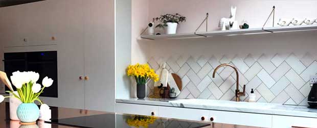
A typical kitchen is going to be a busy space, far more so than the idealised versions portrayed in showrooms or glossy magazines. It’s going to have wall cabinets, appliances, shelving, work surfaces and more, and no matter how large the area you have to play with, it’s easy for it to become crowded. This is even before the reality and clutter of daily life intrudes. Bearing this in mind, choosing a light, neutral colour for the walls is a sensible direction to go in, so as not to limit the sense of space right from the outset.
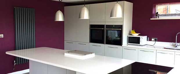
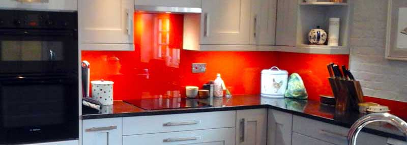
You may have visions of a warm and welcoming red kitchen to cheer you up in the depths of winter, but this is best achieved with splashes and highlights, not by filling the entire area with claustrophobia-inducing colour. Cream, warm pastels, and even beige shades are all appropriate choices, providing a calming and unobtrusive backdrop to build your kitchen around.
If you want to add a little colour variation to your walls, always bear in mind the 60:30:10 rule – make 60% of the surface a light, neutral shade, with 30% in something a little more striking, and then limit the more impactful and dominating colours to only around 10% of the area.
Flooring for Contrast
On the other hand, you can afford to be a little more adventurous with your choice of flooring. A darker shade will not only be more forgiving of the inevitable spillages and other mishaps, but will provide a space-enhancing contrast to the paler walls. Depending on your overall decor theme, dark hardwood or stone tiling can be highly effective in making your room seem more spacious. However, in a larger kitchen, the expanse of darker flooring can be broken up with rugs or mats if it becomes overly dominating.
Lighting Considerations
One crucial aspect of your basic colour choice, and one which is often overlooked, is the importance of lighting. Pale pastel shades may look lovely and bright when the kitchen is flooded with morning summer sun, but will they seem cold and clinical under artificial lights on a dark autumn evening?
Wherever possible, test out your colour choices under a variety of lighting conditions, both as single colours and in combination, to give you a realistic idea of how they’ll appear under difference types and levels of illumination.
Cabinets and Units
As mentioned, these are important foundations of your kitchen’s look, and are not easy to change once installed. Like walls, it’s always better to err on the side of neutral shades, and brightness is usually a safer choice than boldness. If you have a large amount of wall-mounted cabinets and free-standing units, then a paler pine finish, for example, will be less overwhelming than a dark mahogany, especially in a smaller space.
That’s not to say your choice needs to be boring. Subtle stains can take your cabinets in an interesting direction – for example, a light cherry finish will combine beautifully with cream walls. Splashes of colour can be added through contrasting handles or surrounds, inset panels, or even by painting the interior of glass-fronted cupboards.
Also, you can gently vary the colours between your different pieces of furniture to provide interest and contrast. In general, darker shades should be reserved for units which are closer to the floor, with paler ones used for higher wall-mounted cupboards.
Worktops – Function and Beauty
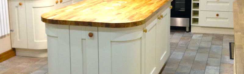
Your choice of worktop is a tricky balancing act between practicality, budget, and – of course – style. Of course, your choice will also have a huge impact on your overall colour scheme. Wooden or wood-effect laminate surfaces give a warm and natural look, and are a fairly neutral choice which will fit in with almost any decoration style. They’re available in both light and dark colours, although of course they tend toward the browner shades.
Stainless steel is perhaps more stylish and impressive, but will only suit a more modern and bright kitchen, rather than a cosy farmhouse-style one – and not to mention, these shiny surfaces are extremely difficult to keep looking perfectly clean. Nonetheless, brushed steel surfaces backed by white walls with wooden flooring looks thoroughly modern and stylish.
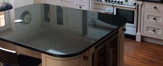
Granite and other types of stone surface are durable and good looking, but tend to be expensive. However, with their colours ranging from grey to terracotta and darker, stone worktops can provide a welcome contrast to paler cabinets and walls, especially when combined with a sympathetic floor finish.
What to Avoid
No matter how much time you plan to spend in your kitchen, you should never lose sight of the fact that it’s a room based around food. One subtle but important fact related to this is that colour schemes based around blue are risky – there are few blue foods in nature, and studies have been shown that this particular colour is an effective appetite suppressant! Combine this with the somewhat sterile appearance of blue colours under many types of lighting, and it’s perhaps best to leave blue as a highlight or contrast shade rather than as the foundation colour.
Also, always be aware that a busy kitchen isn’t a controlled, static environment. Even if a complicated colour scheme looks fine when it’s first installed, once the inevitable clutter starts to build, things can start to look very crowded and confused very quickly.
It’s therefore a good idea to err on the side of conservatism when designing your kitchen’s colour scheme. For a real-life kitchen in a busy home, even a minor repaint can be a source of major disruption, never mind a complete redesign. Aim for something that will last and withstand changes in fashion, and once again this means generally sticking toward the more neutral and calming end of the spectrum rather than exhibiting extreme originality and flair.
On a similar note, beware of introducing too much pattern and variation into a kitchen. A bathroom may benefit from patterned floor tiles, for example, but a kitchen not so much: simplicity should always be the key consideration in such a busy room.
Lastly, it’s best not to forget the effect of your kitchen’s colour on your home’s desirability and value. Even if you have no immediate intention of moving home, be aware that an idiosyncratic colour choice will be an immediate turn-off for most buyers, and this can be an expensive failing to fix should you decide to sell in the future.
Finishing Touches
Once your basic kitchen decor is decided, it can be enlivened by your choice of finishing touches. These can take the mood in almost any direction, and have the excellent advantage of being relatively easy and quick to alter if they aren’t working well, or when you simply fancy a change. Here are some ideas.
- In a modern kitchen, especially one with stainless steel appliances or surfaces, hanging shiny utensils from a wall-mounted rail can provide interest while enhancing the bright and contemporary look. Similarly, storing metal spoons, whisks, and so on in a jug can add contrast to an expanse of work surface.
- If you’re looking for a more homely or farmhouse effect in a fairly pale kitchen, then brightly coloured antique pottery on shelving will provide both interest and easily varied decoration. If space permits, you could even go so far as a Welsh dresser or similar statement piece filled with a display of colourful crockery.
- Hanging bunches of herbs, flowers, or even chillies or garlic to dry can provide a natural colour contrast against paler walls, and looks equally at home in a traditional or modern design.
- Similarly, judicious placing of pot plants or even climbers can add splashes of colour which look great, especially in corners.
- If your kitchen has a dining area or breakfast bar, using brightly coloured furniture can add a strong hint of life and excitement, especially when in contrast to more practical and neutral cabinets.
- As mentioned, lighting can have a powerful effect on the colours you use, for good or for ill. If choosing a neutral scheme has left the overall effect a little bland, don’t be tempted to overcompensate by getting out the paintbrush. Why not employ a few coloured lamps to provide focussed spots of interest?
